")
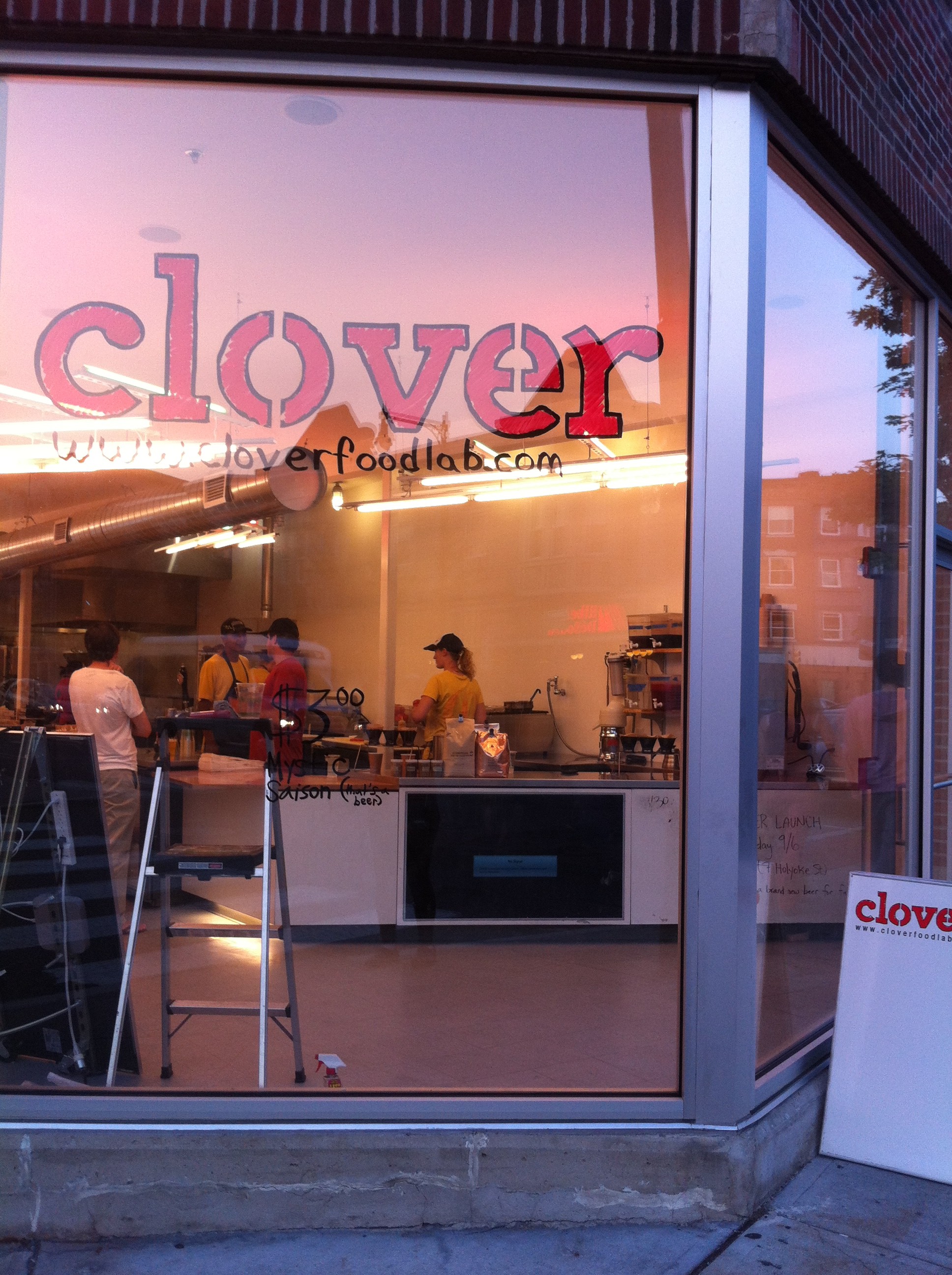
Last night you might have seen me on a stepladder updating the new logo color at the HUB. It’s going from yellow to red, to match tomatoes and the new Clover shirts you might be seeing today.
I was scared that I wasn’t going to be able to get the yellow paint off. I was ready to spend an hour scraping with a paint scraper. Ayr said no, go to the dollar store and get a thing of Windex. It worked perfectly.
We’ve been talking about ways to make the HUB more inviting to the street, while keeping the food and employees the main focus. We had a bunch of first-time customers last night who were asking what is this? So we’re starting with color logos, then moving to better messaging on the active walls. Too many times it looks like what it looks like in the picture, a black screen with an error message. Not really what we want you to associate with Clover.
So what do you want to see? What can we do to make the HUB a place you want to stop by?

