
We’ve been playing with color. You may have seen the uplights at HSQ or the HUB, that was our first move. Then the banner on the website changed. From Mary’s original outlined logo to one with color in and around it. Now we’re playing with a new way of making the A-frames and trucks to bring color into the logos.
The original idea behind all of the white was that we wanted the environment to disappear, to be nothing more than a stage for the people and the food. So instead of bright plastic menu boards with bright colorful pictures of food (walk into any fast food joint and you’ll see what I mean), we wanted to isolate the color to the living (non-plastic) things: soups being cooked on board the truck, employees chopping stuff, colorful drinks being poured, employees smiles. My architects described the trucks as giant oysters, hard on the outside, but warm and engaging on the inside.
I think we’ve had some pretty good success with this approach. Less at the restaurants, more at the trucks. That’s part of why my architects and I are thinking really hard about color and lighting in v.3 of the restaurant.
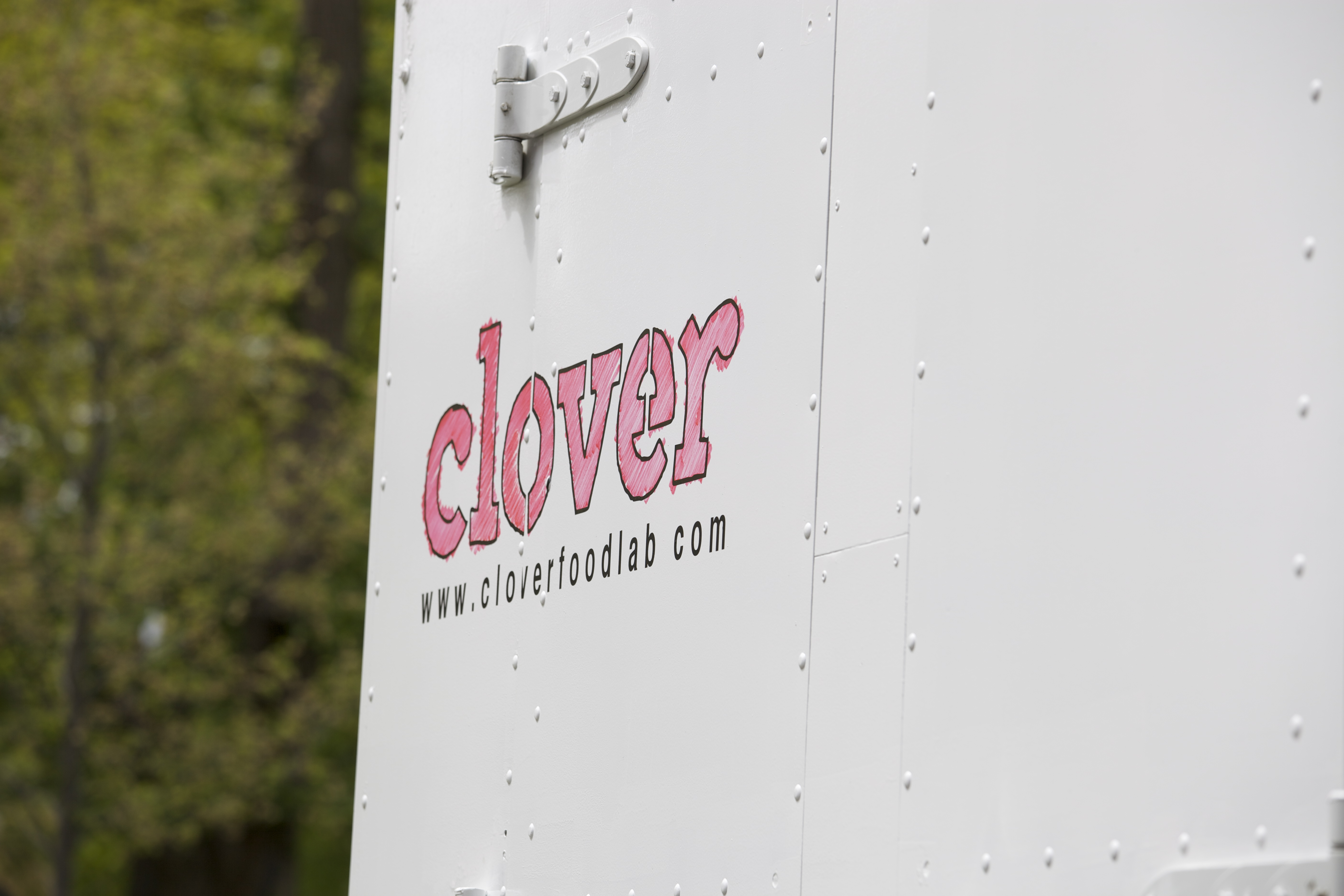
In the meantime I thought it might be fun to create an intersection between color and light. So we’re playing with translucency, colored lights, reflected colored lights. These new logos are made by printing the logo outline to vinyl with this nifty craft vinyl cutter I picked up, applying the vinyl to the A-frame or truck, then using a special colored pen to fill it with color. The color comes off easily, so we can keep it changing. We’re going to experiment with having a seasonal color, something that would be on the T-shirts, in the food (e.g., rhubarb), on the website banner, in the uprights at the restaurants, in the awning lights at the trucks, and on the logos on the trucks and whiteboards.
While we’re experimenting let us know what speaks to you. What works, what doesn’t.

