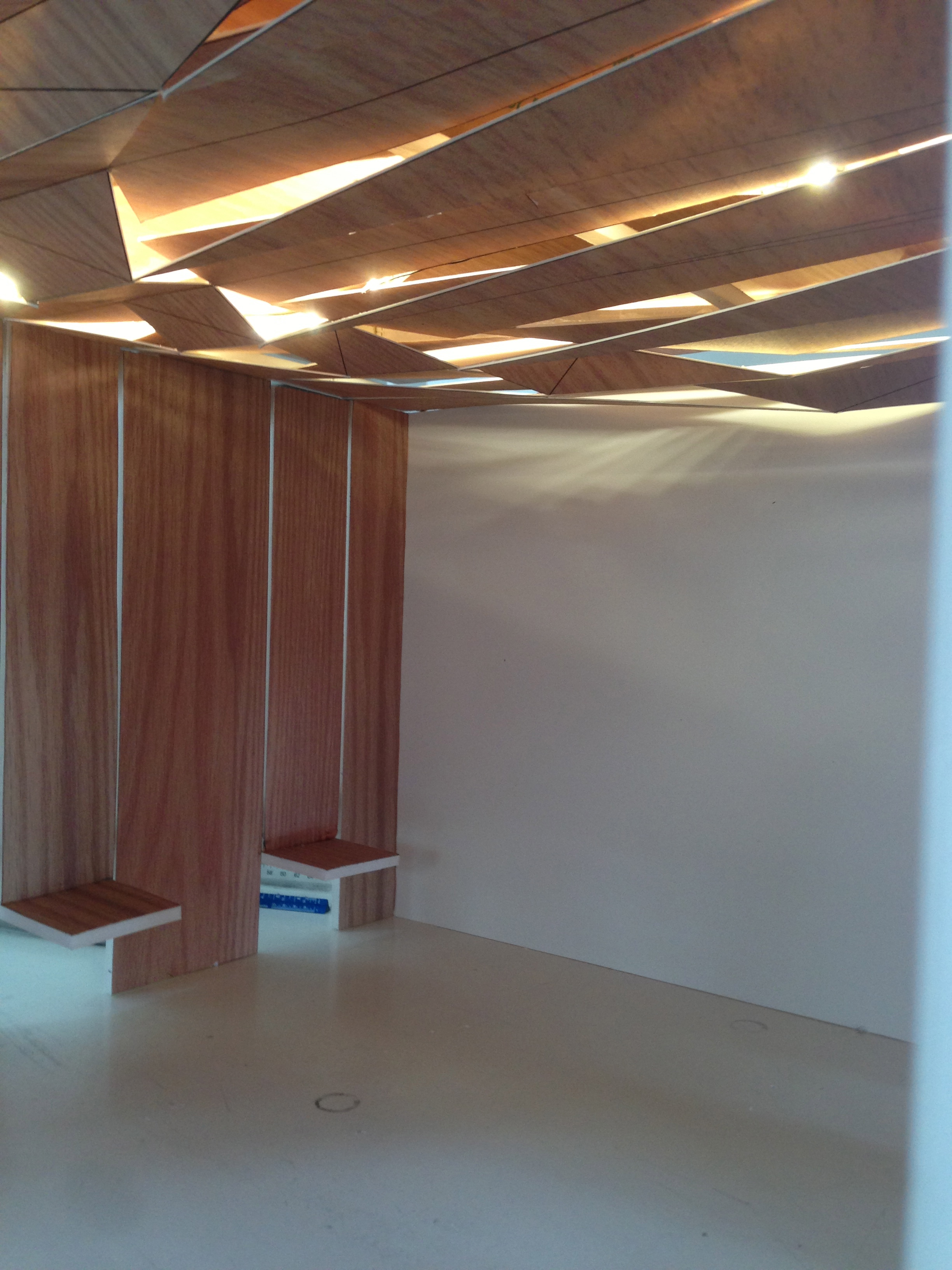
That almost looks real, doesn’t it? Not yet, right now it’s just a scale model we’re using to explore ideas.
My architects and I have this plan for wood paneling and ceiling at the Burlington restaurant. The restaurant is really long. And most operators would just draw a line at the 2/3rd park, that’s 1/2 to 2/3rds of space behind the wall, the remainder (1/3 to 1/2) of the space visible to customers. We do things a bit differently. Our kitchen is open. Everything is open. The only space customers will not have access to will be the mop closet and the back hallway. So instead of a space with a rectangular footprint we have a space that looks almost like a line. It’s so so long.
John and Jinhee had this idea early on to use wood to help break the space. There are some other ideas we’re playing with, but this wood paneling is going to be an important part of our plans. We’re going to have an entry, a long counter along the kitchen (like the HUB), then a customer seating area towards the back. The wood will serve another function. We’re hoping it will make the space a more inviting and welcoming space.
When we designed our restaurant at Harvard Square we were very focused on making sure the space was designed for volume. I love Crema in Harvard Square, but I was terrified that we’d create a space that people camped in Crema. Anytime you go in there you can’t find a seat. So that’s part of the reason Harvard Square had has hard surfaces. We wanted to create an environment that was inviting, but not too inviting. I was inspired by In-N-Out Burger, Chipotle, and others that manage these same issues.
Well, we made a mistake. You know we make lots and lots of mistakes. Our thinking has evolved. As Harvard Square evolved I began to think: “what if the space was inviting, but not 100% of the space. What if say 20 or 40% of the space made you want to stay put. But the rest was available for the in and out customers?” So we changed out direction. Now my architects and I are working with the idea that we want to create a space that entices folks, that you don’t want to leave. It’s a total 180° shift from where we started.
Back to the wood paneling. We started with simple paneling, but Jinhee and John came up with the idea of having the wood continue up the walls, then over the ceiling. It creates a space. We were thinking about using LED strips run in gaps between the panels to light the space. I think we liked the idea of the lighting integrating with the space.
But when we modeled it in the studio the LED strips just didn’t provide enough light.
So now we’re considering a different idea that Adam (who works with John and Jinhee) showed to me today. Before our meeting I’d heard a bit about the idea, and it just didn’t sound that great. But having seen the model I think it’s amazing. It’s subtle, but the pattern makes a C-shape, you know, C for Clover.
The ceiling is made of plywood. The plywood is cut in a certain pattern. You can see the panels angle. And we’ll mount fluorescent tubes behind the panels. The light will spill out from the cracks in the ceiling creating the integrated feeling we want, drawing the eye to the seating area from the restaurant entrance, and bringing life and interest to the very long space. We’ve very excited.
Oh, if you’re curious, those slats that come out from the wall are tables. It’s going to be amazing.


