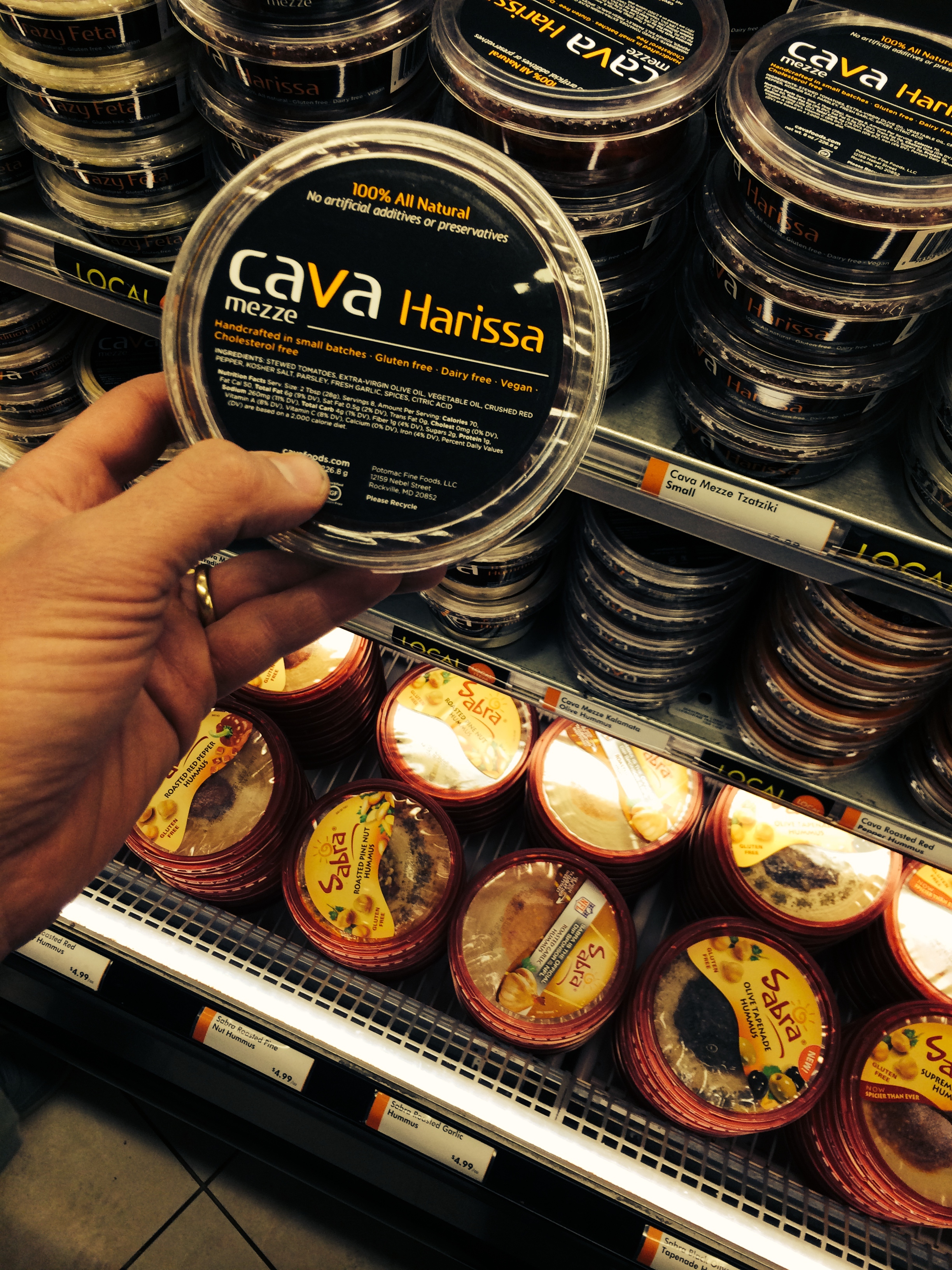
As you know, we’re working on packaging for WFM and for use in our restaurants. I’ve been snapping references from others. This one was taken in DC. It’s a restaurant down there that sells “dips and spreads” at various places. I think they do well with this. We’re trying to think how to use traditional packaging (which will help us avoid waiting or a special run etc.). But we want to end up with packaging that is Clover feeling and beautiful.
I think we’ve achieved this in the restaurants. Our paper bags are beautiful, and I think they convey exactly what we need them to. But they’re the most ubiquitous simple paper bag out there. Likewise our cups aren’t particularly special, we print in a single color ink, it’s even free from our manufacturer. But I think they’re stunning, especially the cold cups.
If anybody has any packaging references they love and think could be inspirational to us send our way!


