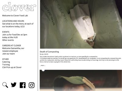
I’ve been working on a new version of our website. It’s a bit scary, because what we’ve been doing works so well for so many of our goals. But We’re excited to move forward.
I thought I might open up this process a bit. We’ll start with a very crude mock-up I made a few weeks ago. The basic ideas guiding this project:
- We want the website to be all real time. All feeds. Nothing static
- This should be a useful resource that engages our customers as well as our staff on a daily basis
- The design should match the content, honest, responsible. We should stand out of the way and let the stories/ people/ food talk for themselves.
- If you hold you finger over our logo you should still be able to tell where you are. This shouldn’t feel like all the other tumbler-inspired company pitch sites out there.
In a couple of days I’ll get you caught up with Nathan’s (designer) first ideas. In the meantime I’d love any comments/ direction. In particular if you can share what works right now, what you’d be sad to lose that will be great. Of course there is a ton that annoys us all about the current design, so ideas on how to fix that are welcome as well. Thanks!


