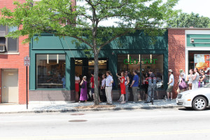
We normally don’t talk about licensing and permitting. Early on I wrote something on this website. Let’s just say I ended up being publicly reprimanded in a licensing hearing. Yes, there is freedom of speech. But I think all business owners are scared of retribution. If you’re a small business retribution can be crippling.
So we don’t talk about this stuff.
But the other month something so crazy happened to me I can’t help but want to share. I’m hoping this helps other small business owners.
This story is about the sign you can’t see in the picture above, our sign for Brookline Village.
We always love to do everything above-board, so the first thing I did was read this 80 page manual Brookline publishes on sign restrictions, etc. I dutifully put together a list of questions/ clarifications, etc. I got great prompt answers from the guy working in Planning. He was super friendly and helpful. This seemed off to a great start. Rules against internal illumination? Nope. Maximum letter size? none. Area of sign allowed by storefront? 26 square feet. Any color restrictions? Nope. You get the idea. I finished our application, submitted. Then I got a call. I was told that there were concerns about the proposal and we should set up a meeting.
At the meeting with town officials our proposal was described as not likely to be approved. There was a long list of issues, including:
– The use of the words “Fast Food” on the sign, a big no-no apparently
– The fact that the letters on the sign were white
– The size of the letters on the sign (22″ inches for the letter “L”) were too large (despite being smaller than the previous sign, and despite being smaller than required by the sign ordinance)
– The sign was not symmetric. This was a big one. We designed the sign to be to the left side of the storefront. This allows some visibility when looking across the street. Otherwise it would be obscured by the tree.
– The letters were internally illuminated (again, no issue with ordinance, just told this would not fly)
– The letters obscured some molding. I investigated and found this molding was from 1999 Home Depot.
– Did I mention the sign design said “Fast Food”?
I asked what type of design criteria I could use to make a cool sign. This list of objections consisted entirely of things that were not in violation of the ordinance, so I was starting to wonder how I could know what the boundaries were. I was told to make a sign that looks like the Dunkin sign next to us. We don’t really want a sign that looks like the Dunkin sign next to us.
I didn’t know what to do. Coming out of the meeting I was certain we would fail at our hearing. I prepared a long document detailing our design decisions, why we want to use the words “fast food,” reference images from around the Village. 3 alternate sign designs. It was a lot of work and a large package. And I was sure it was going to fail the board’s review. But maybe we’d get some direction that we could use to make a killer version #2.
Well guess what happened? I went to the board review expecting to fail, but perhaps get direction. Instead they were awesome, thoughtful, and very supportive of our design! The person I’d met with before worked for the town. But the board is made up of a different group of individuals. The hearing sounded something like this (I’m paraphrasing heavily):
BOARD: Looks great
TOWN OFFICIAL: But what about the height of the letters?
BOARD: Don’t see any issue
TOWN OFFICIAL: But what about the white letters?
BOARD: There was a time when all the storefronts had to be brown. Then green with gold signs. I’m glad that we’ve moved forward. The Village would benefit from more inventive energetic design.
TOWN OFFICIAL: But what about the letters obscuring the molding?
BOARD: What is the plan? (to me)
ME: We were thinking we could paint the molding the same color as the store front and carefully install the sign so as not to damage the molding.
BOARD: Why don’t you just remove the molding
ME: Really? I can do that?
BOARD: Sure. That would be much better…
OK, I’ll stop here, but you get the idea. It was shocking to me and really amazing. The board made some really good substantive suggestions, like justifying the left letter with the window (which I hadn’t spec’d but thought was a great idea).
And the words “Fast Food”? The board had no problem at all.
So why am I writing this potentially risky post? Well if I wasn’t so stubborn there is absolutely no way I would have proceeded with our design. And guess what? There wasn’t anything wrong with it! But it got me wondering how many creative/ vibrant/ great ideas are squashed in the pre-application phase? I mean, most business owners would have done the prudent thing and re-designed away from what they wanted towards something like the Dunkin sign. A more visionary and powerful design would have been killed while it was only an idea.
So everybody out there, don’t be afraid to go after the sign you want. Don’t be afraid to represent yourself in front of town boards. In my experience they’re run by folks who take their jobs very seriously and are very reasonable.


