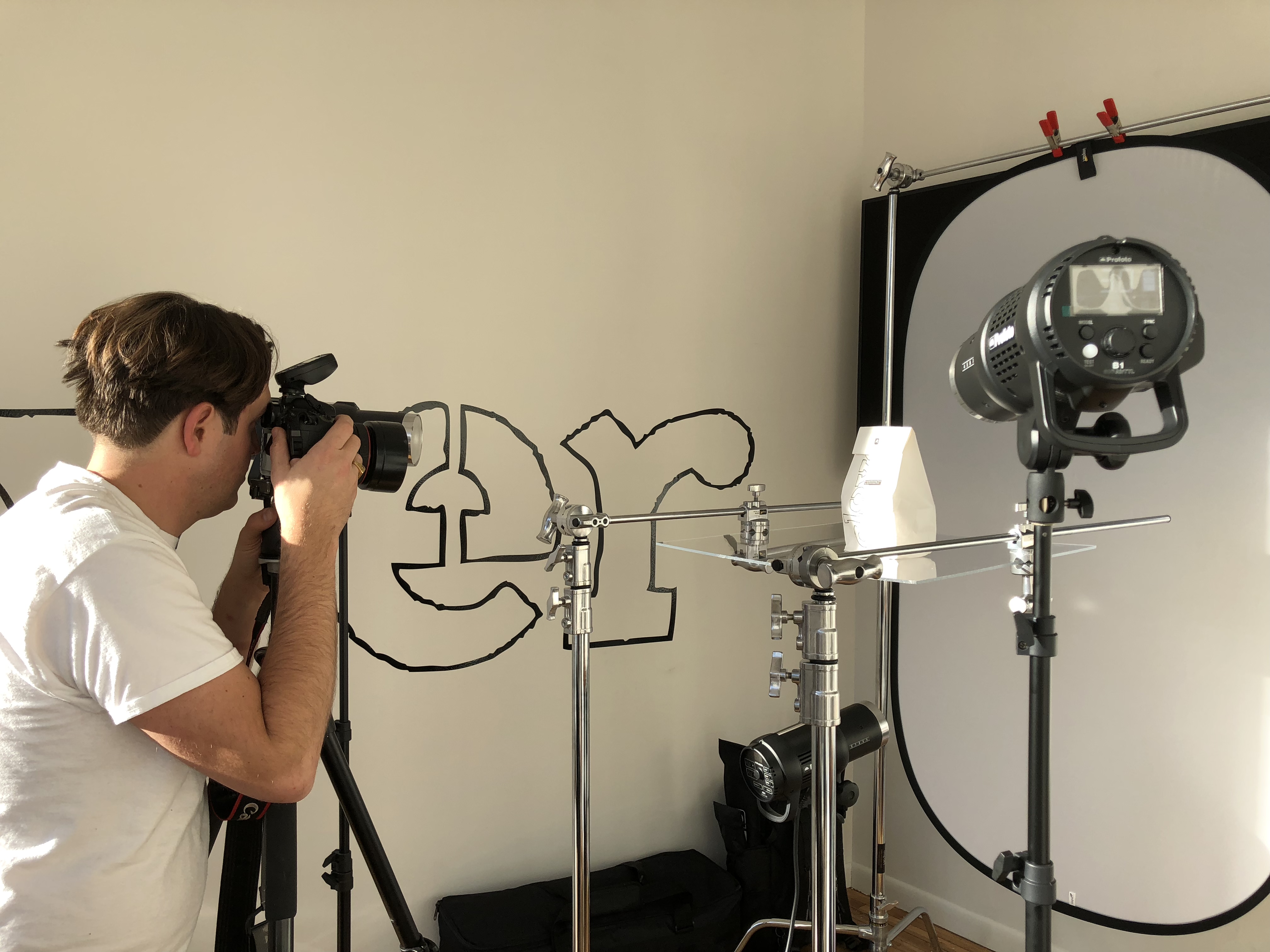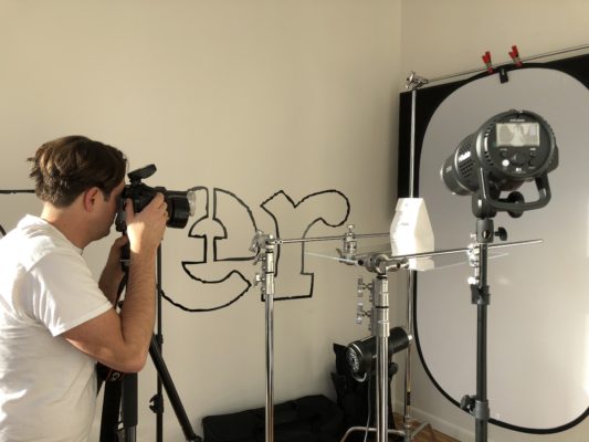
This may just look like Ayr photographing a paper bag, but it really represents a whole journey into menu photography.
A couple months ago, when we were in the middling stages of readying our order-ahead app for public release, we knew we needed to do something drastic to upgrade the look of the whole app.
Menu photos!! It felt like not a big deal to us, but taking a step back we realized it’s a big part of how everyone interacts with our online menu every day. Redoing the photos could make a big difference. Give a sleeker, cleaner feel.
The first day, Ayr went out and bought a ton of different colored foam core/posterboard and used clips to jerry rig backdrops for us to test out. Maybe a green screen would work? Maybe a blue screen? (since there naturally isn’t really any blue in our food so the background would be easy to edit out of the shot)
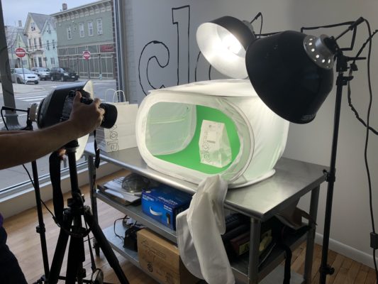
Verdict: not great. Difficult to edit out the shadows created by the backdrop. The green/blue were reflecting onto the white of the bag. Fail! Onto the next idea.
We ended up looking up different set-ups/advice videos on Youtube. And then Ayr hit the jackpot. A video that showed exactly what we wanted!! (I can’t find it right now but when I do I’ll link it here).
Ayr literally paused the video and zoomed into it so we could cop the guy’s gear. (Thank you guy!). We ordered it all on B&H immediately and it arrived days later.
We set it all up and it worked perfectly. Boom. For reference, here’s an old-menu photo of our Lavender Lemonade next to a new-menu photo of our Lassi Soda:
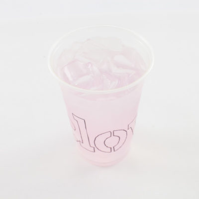
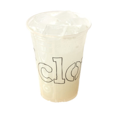
Kind of incredible I think. We were able to clip away a white background on a WHITE SODA in a CLEAR CUP while preserving color/white balance integrity. Very exciting for us. Sometimes having the right gear makes all the difference. Sandwiches are looking especially good with this new photo capture process.

