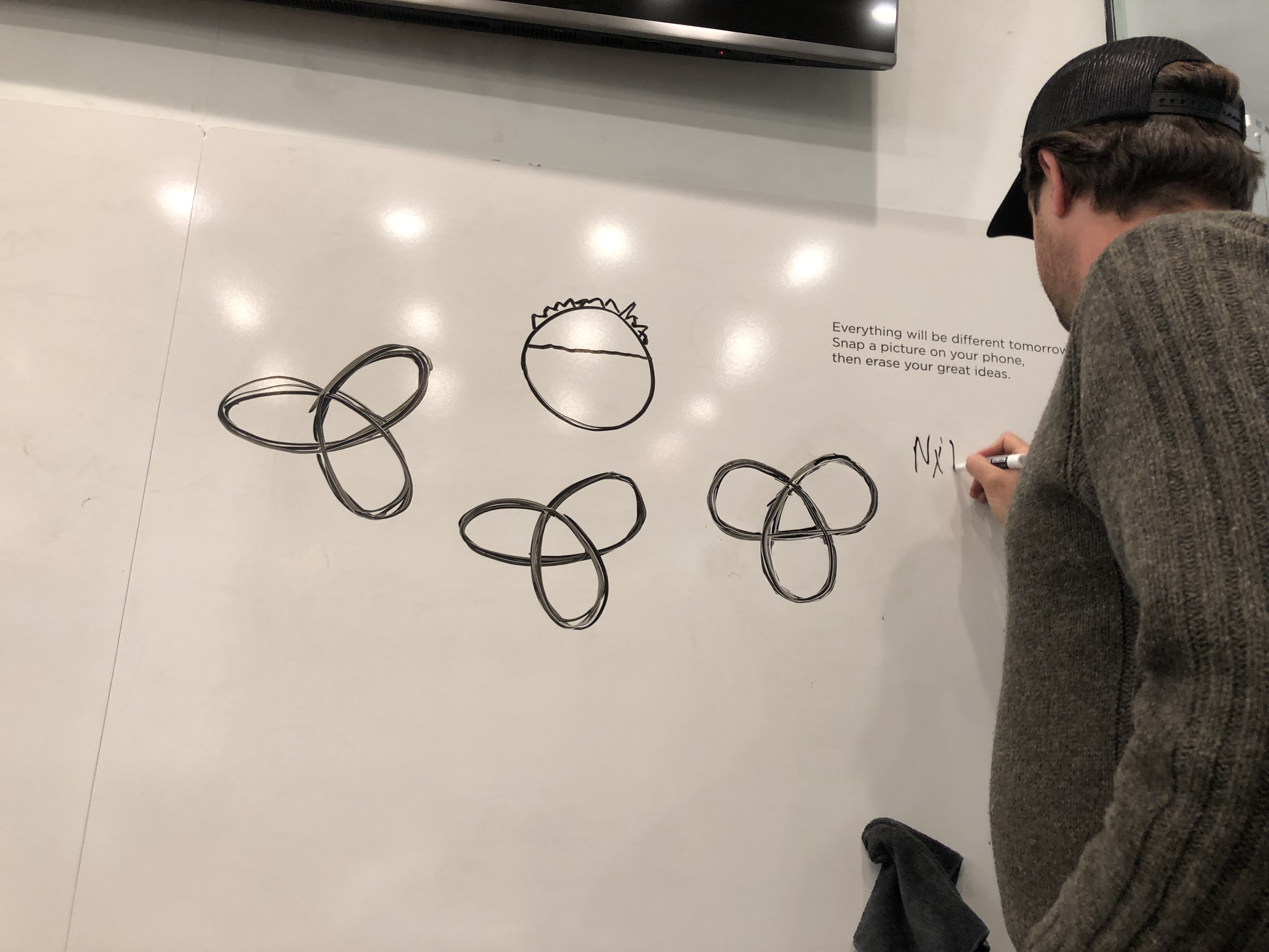
That’s me. I’m drawing Clovers (and a Chickpea Fritter).
We’ve hired a design firm to help us with some very specific challenges we’re facing. We never really landed on an “icon” style logo. And we need one badly. For blade signs. Did you ever notice Clover restaurants are sign-less? And for our app.
We hired Perky Brothers. They did some really great work for Little Wolf (one of the coffee roasters we buy from). They have been great. We’re working primarily with Jeff. And I think he’s a really gifted designer. They talked me into a project that’s a little more broad than I originally imagined. So we’re getting a new iconic logo design, a revised “clover” logo that includes “clover food lab,” and a style guide (colors, etc.). People in the industry call this Brand ID work. And in our case we really like where our logo stands, so it’s more of a refresh/ extension than a re-branding effort. The whole project will cost us a little more than $10,000, which is within our budget and frankly overdue.
When we finish this project we hope Jeff and team will be up for helping us with some packaging design work. And in the future I expect we’ll have other projects with which we need help as well.
They came up with this 3 leaf Clover design. The idea is that it looks a bit like a nuclear symbol (lab) and a clover (clover). I love that it’s simple and repeatable and riffle, and geometric. I think we’re going to have a lot of fun with this one.
The chickpea fritter is something Blue, my 10 year old son, drew. I liked it a lot. It’s a perfect simple symbolic representation of our sandwiches. Not sure how to use it but we’re thinking that through. Maybe as a prototype simplified design for sandwiches? For stickers/ pins/ etc.?


