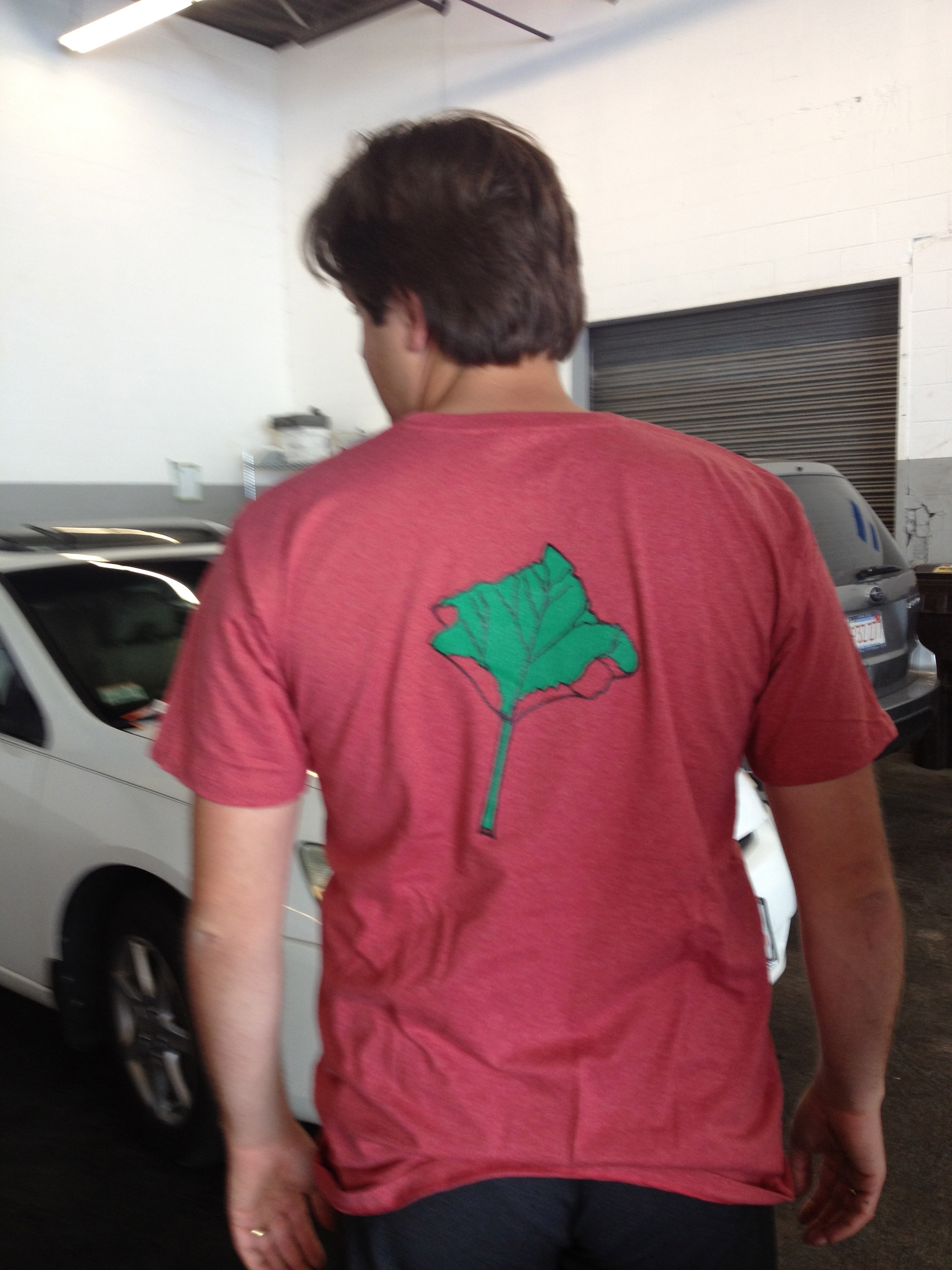
This is a T-shirt I’ve been wanting to do for a long time. Mostly because I love rhubarb so so much. But I’m not very happy with how it turned out. Notice how large the food icon is on most of our shirts. On this one it’s pretty tiny. Which is really too bad. I’ve also heard some criticism about the art on this one. Some folks don’t think it looks like Rhubarb.
I make a new shirt every couple of months. The plan has always been to engage local artists to design different shirts, but I haven’t really pulled that off yet. Not enough time to go around and find the right artists/ etc. In the meantime I have a really simple formula that I can execute myself. A big line image of a fruit or vegetable that is in season, our logo, date, and a T-shirt with a color that is close if not a perfect match to the produce. I had this idea that over time employees would be able to wear the T-shirt they like best, being able to maintain some sort of uniformity while allowing employees a degree of personal expression (especially when the artist shirts kick in). And I thought the sea of colored shirts would be fun in the context of our otherwise color-less trucks/ restaurants.
Lucia (communications) and I have been talking about using the color of the T-shirt as a sort of color theme for the month. Don’t get too excited, but we’re introducing a little bit of color to the trucks/ restaurant. The colored logos and colored lights. And we’re going to have them shift seasonally. I’m sure there are some marketing folks out there cringing with the idea of changing colors. But we’ve always been a company with a lot of change and evolution and I think this might be fun for everybody.


